主要用途: 物販店舗
施工: D.BRAIN、カリモク家具
クレジット: グラフィック: Aesop/照明計画: BRANCH lighting design
所在・会場: 東京 渋谷
延床面積: 85m2
設計期間: 2018.7-2018.9
施工期間: 2018.10-11
写真: Courtesy of Aesop
ウェブサイト: http://www.aesop.com/
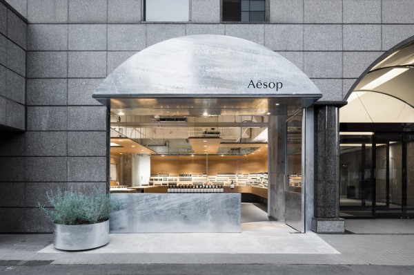
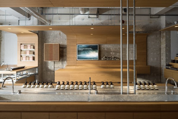
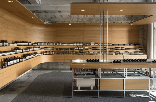
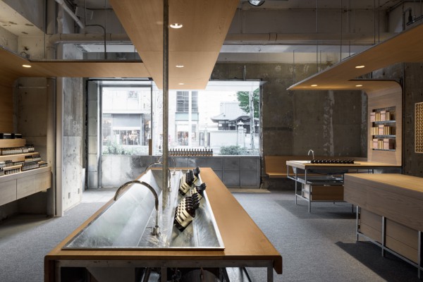
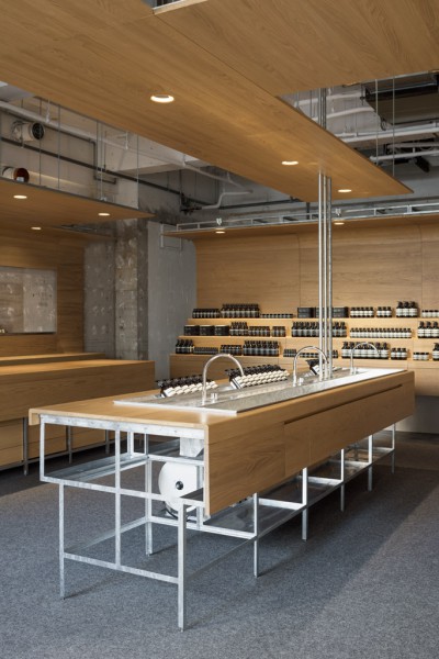
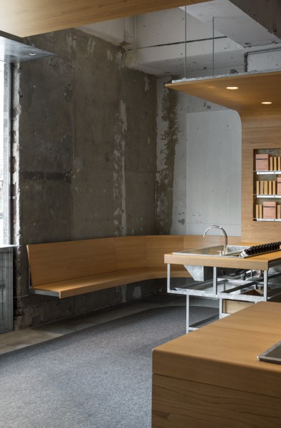
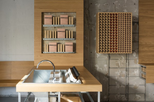
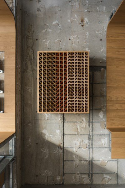
オーストラリアのスキンケアブランドであるイソップの、新しく渋谷にオープンする路面店の内外装計画。明治通り沿いにあるビルの1階で、間口7m、奥行き12mの空間である。 日々変わり続け、新旧が入り混じる渋谷の様子を手がかりに、下地の状態と、仕上がった状態とが共存する空間を考えた。 元の内装を解体して現れたのは、度重なる改修の跡が刻まれたコンクリートのスケルトン空間。その空間をそのまま活かしながら、大きなシンクを中心とした回遊的なプランとし、売り場の広さを利用して雛壇状に構成された壁側の商品棚が、店内を包み込む。これら什器の木部には全て国産のクリ材が使われており、質の高い家具のような仕上がりを目指して、家具メーカーのカリモク家具に製作を依頼した。人の手に触れる部分は、思わず撫でたくなる滑らかなディティールで仕上げられているのとは対比的に、人の手に触れない部分は、仕上げられていない製作途中の家具のように構造が露出している。構造を含め、シンクやファサードなど、今回使われる鋼材は耐食性のある溶融亜鉛メッキ仕上げとし、金物の素材感を統一した。床は、既存のコンクリート床に対し、人が歩行する場所のみ、カシミア混紡のカーペットを敷くことで、硬い路面から店舗へ入る際に柔らかな印象を足元からも与えられるようにした。 窓際のコーナーをなでるようにカーブさせたベンチは、その脇に置かれたシンクとともに、親密な空間をつくりあげている。 路面店としての顔となるファサードは、その横にある建物のエントランスに施されたアーチ状のゲートを反復したような庇をつけることで、既存環境を引き受けてデザインした。 新陳代謝をし続ける渋谷に呼応するように、新旧のダイナミックなコントラストを持つ店舗空間を目指した。
Principle use: SHOP
Production: D.BRAIN, Karimoku Furniture
Credit: Graphics: Aesop / Lighting design: BRANCH lighting design
Site area: Shibuya, Tokyo
Total floor area: 85m2
Design period: 2018.7-2018.9
Construction period: 2018.10-11
Photo: Courtesy of Aesop
Website:http://www.aesop.com/
We performed the interior and exterior design of a street-level store of the Australian skincare brand Aesop which newly opened in Shibuya. It occupies the first floor of a building along Meiji Avenue and features a space with a frontage of 7m and depth of 12m. We thought of a space where foundation and finish would coexist, taking a cue from the atmosphere of Shibuya, which continues to change every day and where old and new mix together. Taking apart the existing interior revealed a concrete skeleton space with signs of repeated repairs. While using the space as it is, a roundabout plan centered on a large sink and product shelves on the wall side organized like a tiered gallery by exploiting the size of the counter encompass the store interior. The wooden parts of fixtures use entirely domestically produced chestnut wood, and since we aimed for a finish like that of high-quality furniture, we commissioned the furniture maker Karimoku Furniture to handle production. In contrast with the parts that would be in contact with customers which were finished with smooth details that make one want to caress them, the parts that wouldn’t be in contact with customers have an exposed framework like unfinished furniture that is still in production. Including the framework, we used steel materials to give the sink and façade a corrosive-resistant molten zinc coating and impart unity to the feel of the materials in the metal fittings. As for the floor, we spread a cashmere carpet on the existing concrete floor only in areas where customers would walk to give an impression of softness starting at the feet whenever people enter the store from the hard road surface. The bench curves as stroking the corner at the window side and creates an intimate space with a sink set aside. Serving as the face of the street-level store, the façade was designed to inherit the existing environment by adding eaves that appear to repeat the arch-shaped gate applied to the entrance of the next-door building. As though in response to the continuous renewal of Shibuya, we aimed to create a store space that possessed a dynamic contrast between the old and the new.