主要用途: 物販店舗
施工: D.BRAIN
クレジット: ブランディング・グラフィック:THAT’S ALL RIGHT/照明計画:BRANCH LIGHTING DESIGN /イラストレーター:我喜屋位瑳務
所在・会場: 東京 新宿
延床面積: 33.3m2
設計期間: 2023.02-2024.03
施工期間: 2023.11-2024.04
写真: 長谷川健太
ウェブサイト: https://www.canarina.jp/
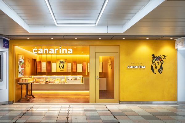
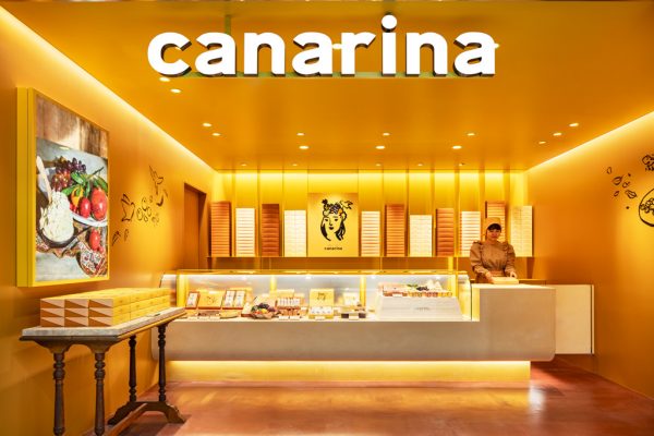
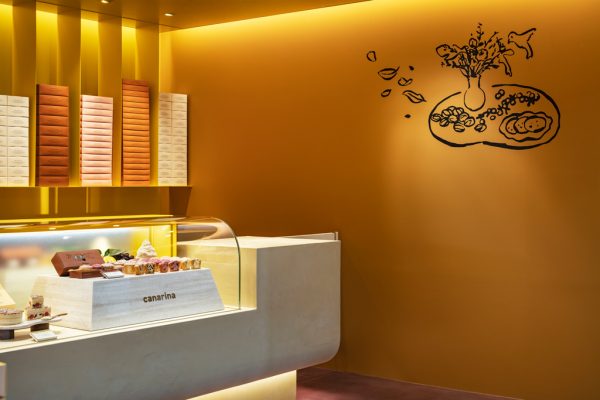
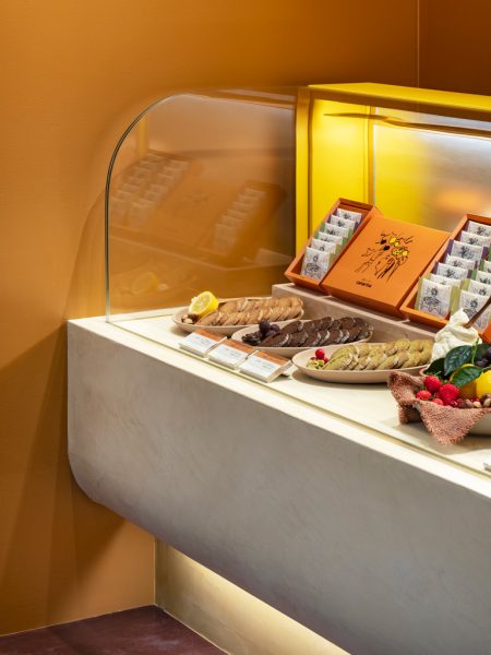
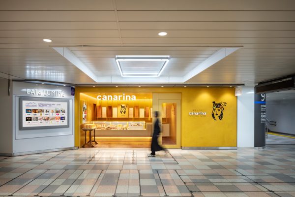
いろとりどりの果実と美しくなめらかなバター を使用したスイーツを販売する新ブランド「canarina」一号店のための内装計画。JR新宿駅改札内にオープンする新たなエキナカ商業施設「EATo LUMINE (イイトルミネ)」の一角に位置し、駅通路に面するにぎやかなエリアに、豊かなブランドイメージを訴求する、人目を引く店舗空間が求められた。
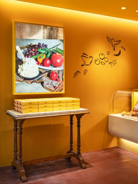
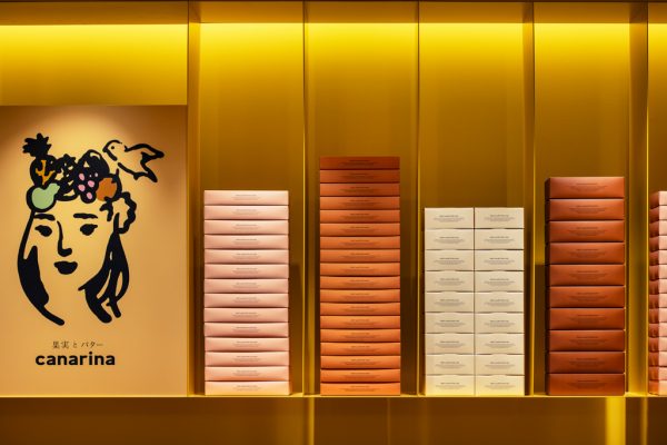
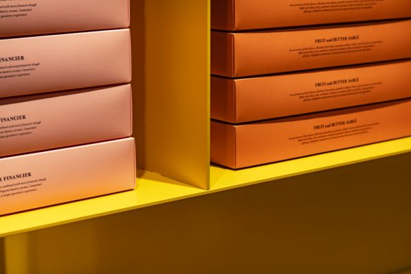
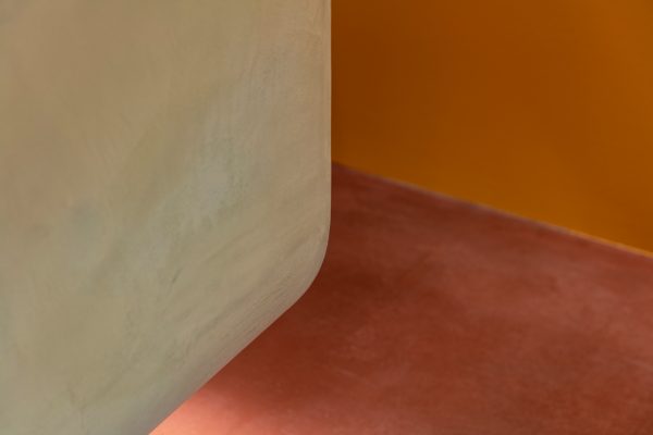
売り場全体をブランドカラーである温かなイエロー色で包み、カナリア(鳥)と上質なバターを連想させる空間とした。正面奥の壁面には、2.3mmの薄いスチールパネルを用いた吊り棚に、線画のイラストレーションや繊細な色合いを特徴とするパッケージボックスを並べることで、パッケージの箱が浮かんで見えるよう計画している。 店内の壁面が平滑な塗装であるのに対し、ファサードやメインのカウンター什器はモールテックスの左官仕上げとし、内装の素材感を変えながら、ブランドカラーに遊び心と奥行きを持たせた。
間口の狭い敷地ながらも、空間を一つの色に染めることでインパクトを持たせ、喧騒な駅構内に、シンプルな中にもおおらかな温かみを味わえる店舗を目指した。
Principle use: SHOP
Production: D.BRAIN
Credit: Branding, Graphics: THAT’S ALL RIGHT / Lightings: BRANCH LIGHTING DESIGN / Illustration: Gakiya Isamu
Building site: Shinjuku, Tokyo
Total floor area: 33.3m2
Design period: 2023.02-2024.03
Construction period: 2023.11-2024.04
Photo: Kenta Hasegawa
Website:https://www.canarina.jp/
The interior design for the first store of the new brand, “canaria”, which sells sweets made with colorful fruits and delicious, smooth butter. In the busy area facing a station aisle, which is located in the newly-opened shopping mall “EATo LUMINE” inside JR Shinjuku Station. The store is new to this mall, and was required to be an eye-catching place that appeals with its rich brand image.
The shop is wrapped up with the brand color, warm yellow, to make the store reminiscent of canaries and high-quality butter. We planned to arrange the packages that look floating by arranging the package boxes featuring line drawing illustrations and delicate colors on shelves made of 2.3mm thin steel panels in front of the back wall. With the store walls painted smooth, the facade and main counter fixtures are finished with Moltex plastering. While changing the texture of the interior materials, we added playfulness and depth to the brand colors.
Even though the site has a narrow frontage, we created an impact by painting the space in one color. We aimed to plan a simple store that offers a warm, welcoming atmosphere within the noisy station.