主要用途: 物販店舗
施工: 日展
クレジット: ブランディング・グラフィック:THAT’S ALL RIGHT.
所在・会場: 大阪 梅田
延床面積: 39.2m2
設計期間: 2021.09-2022.03
施工期間: 2022.03-2022.04
写真: 小川真輝
ウェブサイト: https://drooly.jp/
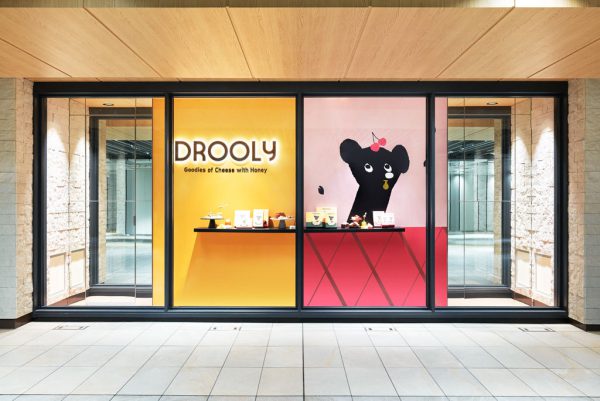
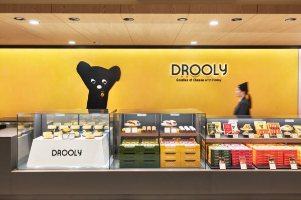
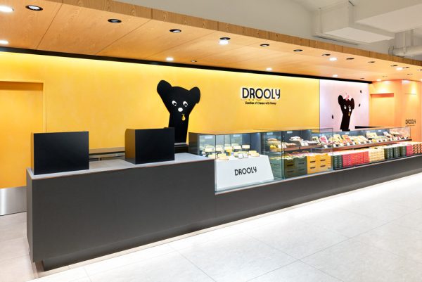
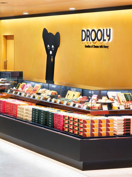
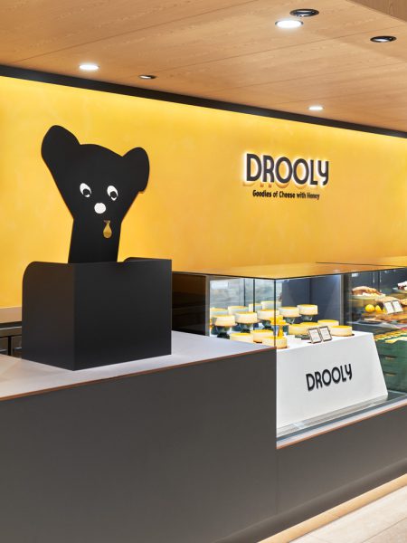
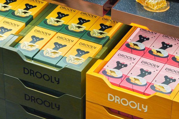
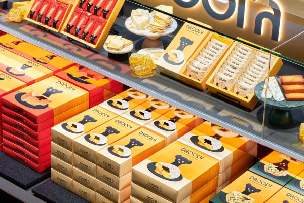
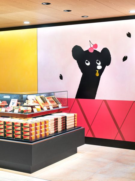
阪神梅田本店にオープンした、スイーツの新ブランド「DROOLY(ドローリー)」1号店の内装計画。様々な店舗が並ぶ中、「チーズ with ハニー」をテーマにしたスイーツを提案する同ブランドのイメージを強く印象付ける店舗が求められた。
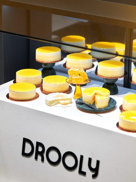
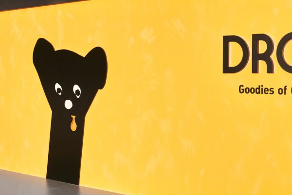
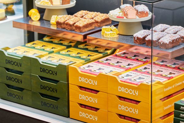
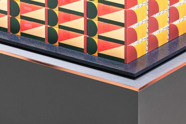
JR改札口に面するショーウインドウの、季節ごとに変わる大型グラフィックに導かれて入店すると、8.5mの長大なカウンターが存在感を放ち、行き交う人々の目を引く。スイーツを連想させる黄色い壁面はムラのある特殊塗装で表情を出し、描かれたマスコットキャラクターから滴るよだれはゴールド色で立体化した。手触りが良いグレーのリノリウムを使用したカウンタートップが、鮮やかでグラフィカルなパッケージを引き立てる。正面右手の壁面グラフィックもシーズンごとに変更され、店舗の印象に変化を持たせる。L型の端部は通路を行きかう人を受け止める効果も持つ。
キャラクターやパッケージがブランドを象徴するよう、カウンターと壁面のシンプルな構成を色の対比でミニマルに実現した。
Principle use: SHOP
Production: NITTEN
Credit: Branding,Graphics:THAT’S ALL RIGHT.
Site area: Umeda Osaka
Total floor area: 39.2m2
Design period: 2021.09-2022.02
Construction period: 2022.03-2022.04
Photo: Masaki Ogawa
Website:https://drooly.jp/
An interior plan for the first store to feature the new sweets brand "DROOLY", which located at Hanshin Department Store Umeda Main Store. Set amongst a variety of shops and stores, the shop needs to highlight the brand's image and showcase its “cheese with honey” sweets.
Attracted by the large, seasonal graphics in the store window facing the JR ticket gate, people passing along the concourse will see the 8.5m-long counter, whose strong presence immediately draws people's attention. The yellow wall, reminiscent of the sweets, has been painted with a special textured paint to make it stand proud and the saliva – quite literally, the “drool” – dripping from the drawn mascot character is rendered in three-dimensional gold. The smooth, gray linoleum countertop forms an impressive contrast to the vibrant and graphical packages. The wall graphic on the right side of the storefront, which changes every season, represents various aspects of the store. The L-shaped end of the fixture also features an eye-catching effect to attract the attention of people passing along the corridor.
The contrasting colors and minimalist composition of the counter and wall expressively enhance the characters and packaging that symbolize the brand.