主要用途: 物販店舗
施工: イノウエインダストリイズ、ダイキアート、アイ工芸
クレジット: グラフィック:北田進吾(キタダデザイン)
所在・会場: 東京ソラマチ
延床面積: 51.12m2
設計期間: 2023.10-2024.05
施工期間: 2024.05-07
写真: 神藤 剛
ウェブサイト: https://guruguru-shakashaka.jp/
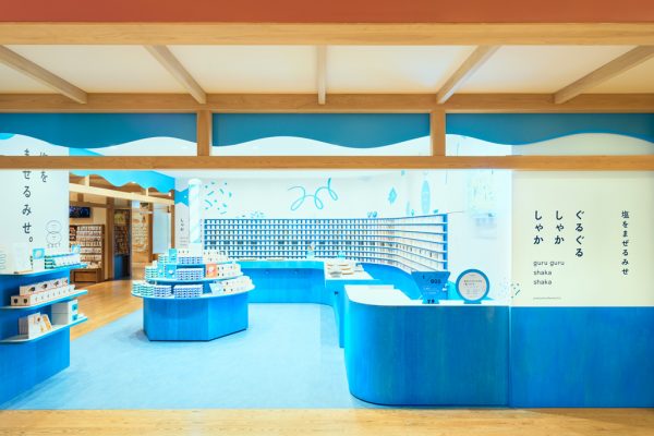
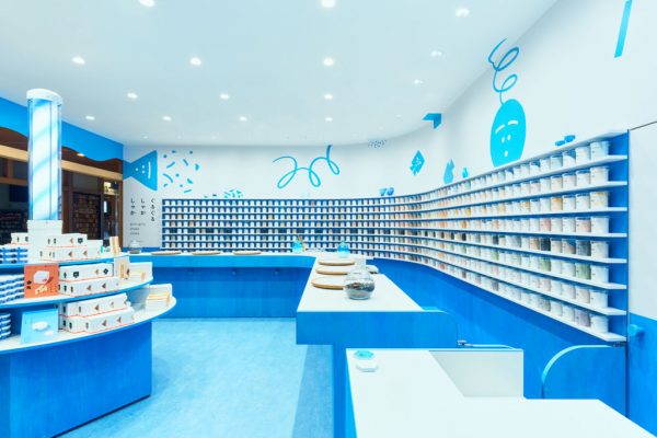
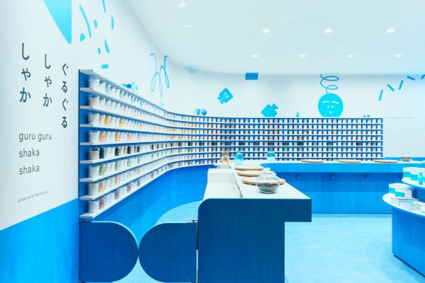
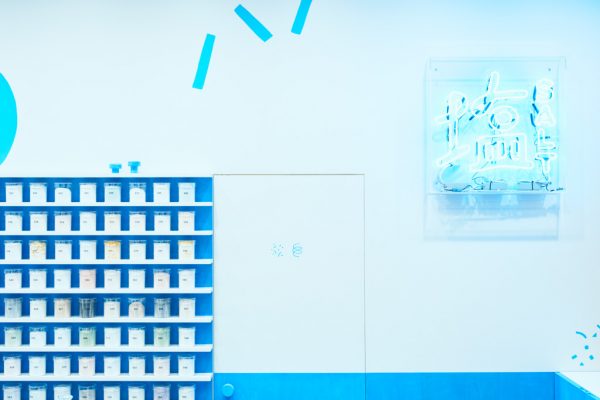
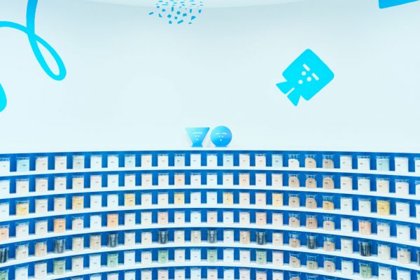
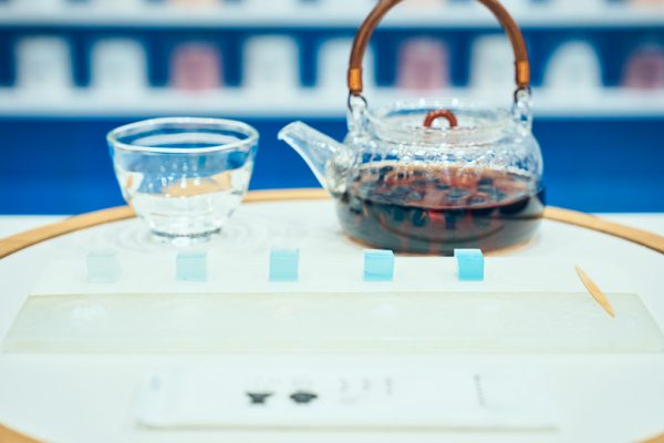
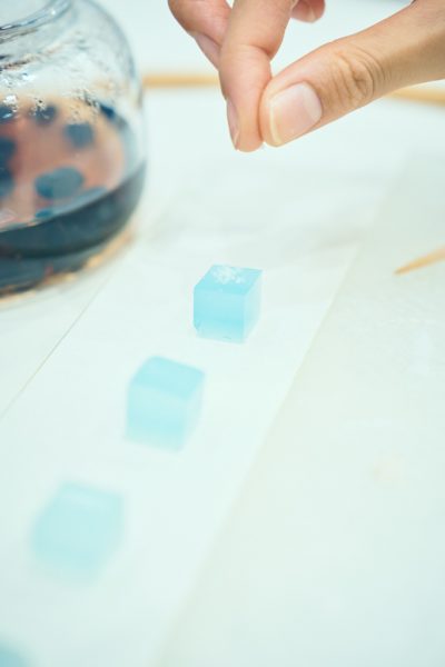
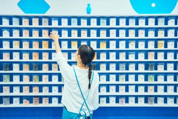
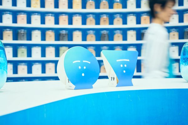
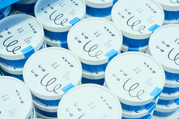
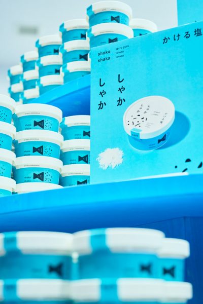
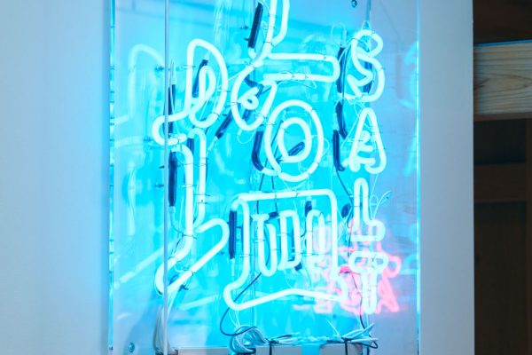
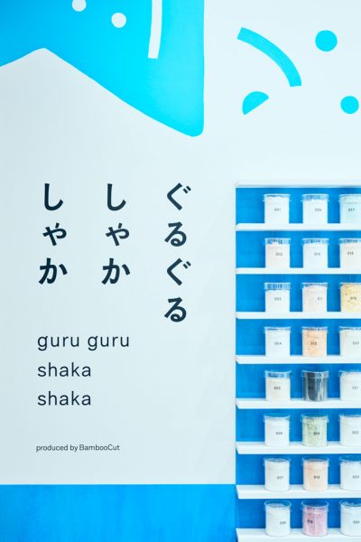
塩の専門店『ぐるぐるしゃかしゃか』の内装計画。本店を企画するBambooCutはトラフが設計を行った「立ち喰い梅干し屋」も運営している。この東京ソラマチ内にある梅干し屋の正面に位置する50㎡ほどの角地が敷地となった。角地を活かして2方向から出入りできるようにし、壁に沿って大きなL字のカウンターを設置した。カウンターでは、青い寒天に載せて塩を食べ比べ、好みに合わせたオリジナルブレンドの塩をつくることができる。カウンターの背後の壁面には600個ものブレンドされた塩が並び、コンサルテーションを効率化するとともに、視覚的にもたくさんの塩がそろっていることを印象づけている。什器も塩をイメージした配色とし、青い部分はシナ合板の染色によって製作した。オリジナルの塩や関連商品を陳列する中央の島什器には、グラフィックをカスタマイズした回転するバーバーサインを載せて動きのあるアイキャッチとした。壁面にちりばめられた、店名にもなっている「ぐるぐる」と「しゃかしゃか」のキャラクターをはじめとした手描きのイラストが、親しみを感じさせる。カウンターの背後に設置されたネオンサインの「塩」は向かい側にある梅干し屋のネオンサイン「梅」と呼応する。初めての業態を展開するブランドの認知を高めると共に、気軽に立ち寄りたくなるような空間を目指した。
Production: Inoueindustries, Daiki Art, AIKOUGEI
Credit: Graphic: Shingo Kitada (KITADA DESIGN)
Building site: TOKYO Solamachi
Total floor area: 51.12m2
Design period: 2023.10-2024.05
Construction period: 2024.05-07
Photo: Takeshi Shinto
Website:https://guruguru-shakashaka.jp/
The interior design for the shop that specializes in salt, “GURUGURU SHAKASHAKA”. BambooCut plans the main store and also runs “TACHIGUI UMEBOSHI YA”, another TORAFU design. The 50㎡ site is located on a corner lot facing UMEBOSHI YA in Tokyo Solamachi.Utilizing the site on the corner lot, we installed a large L-shaped counter along the wall to make the site accessible from two directions. On the counter, customers can make their own original blended salt while they enjoy tasting salt on blue agar cubes. Six hundred pieces of blended salt are arranged on the wall behind the counter to make the consultations more efficient while displaying the large selection of salts available.The fixtures also have a color scheme inspired by salt, where the blue parts are made from dyed linden plywood. The turning barber sign, with customized graphics, creates an eye-catching feature on the center island fixture, where original salts and related items are displayed. Hand-drawn illustrations, including ones of original characters “GURUGURU” and “SHAKASHAKA”, characters, which give the store its name, provide a sense of familiarity. The neon sign “SHIO (Salt)” installed behind the counter corresponds to the neon sign “Ume” of the UMEBOSHI shop across the street.We aimed to create the space as a store for a brand worth its salt and to improve brand recognition, as well as a casual spot to drop in.