
主要用途: 物販店舗
施工: D.BRAIN
クレジット: 照明計画:BRANCH LIGHTING DESIGN/店舗VMD計画:PALMETTO INOUE 井筒晶貴
所在・会場: 京都高島屋
延床面積: 50.7m2
設計期間: 2021.11-2023.4
施工期間: 2023.4-2023.5
写真: 太田拓実
ウェブサイト: https://hiro-taka.com/
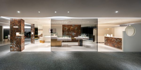
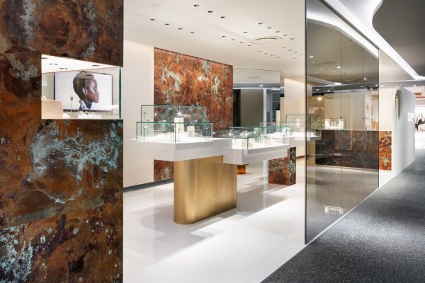
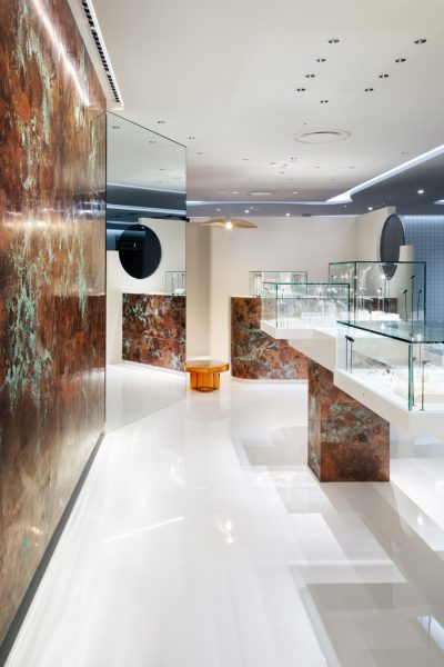
ジュエリーブランド「Hirotaka(ヒロタカ)」の京都高島屋の内装計画。共有部のエスカレーターに隣接する、島状の14m×3.5mの長細い区画が計画地となった。
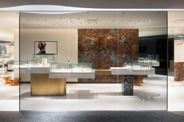
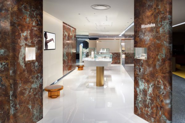
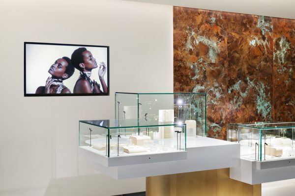
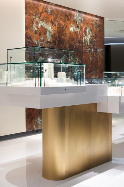
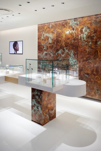
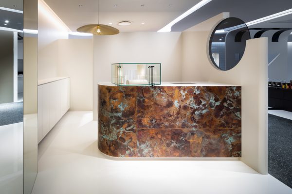
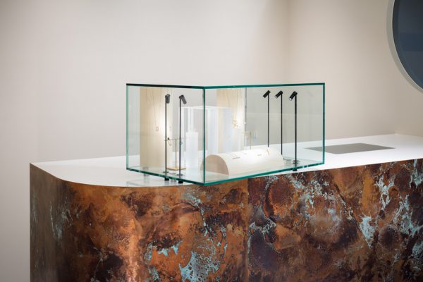
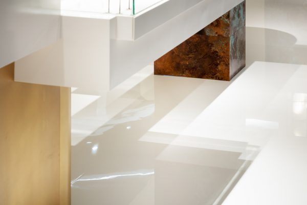
店舗奥正面に、幅3mにわたる銅板に青錆加工を施した、鮮やかでダイナミックな壁面を設えた。通路側に面したコーナー部と、POSカウンター側面などに、同様の加工を施した銅板を配置。一般的な緑青加工を採用するのではなく、銅板素地の茶色と緑青が発生している箇所のバランスをとり、何度もサンプルを作成し試行錯誤しながら設計した。
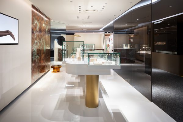
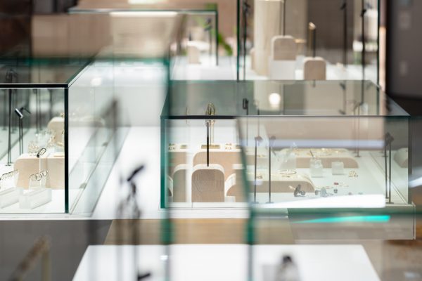
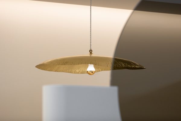
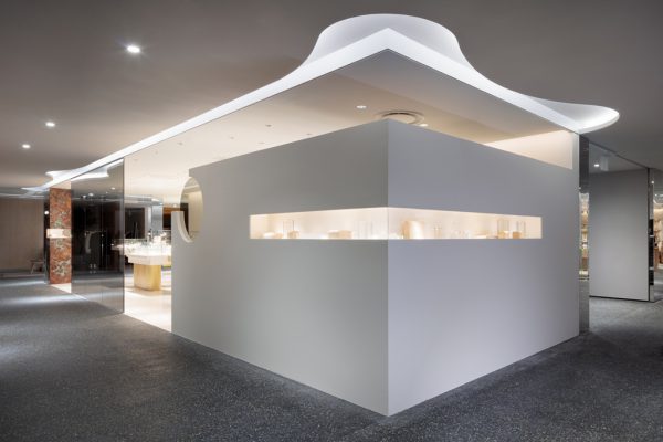
白いエポキシ樹脂系の塗り床とすることで、ギャラリーを思わせる艶やかさを持たせ、店内をより明るく見せながら、銅板を浮かび上がらせた。中央什器にも銅板を配置し、ガラスケースはランダムに高低差をつけ、ディスプレイにリズムを与える。什器の脚は二本柱で支え、浮遊するように演出している。店舗奥壁面上部の天井を折り上げ、区画端まで直線の間接照明を仕込み、銅板と壁面を照らす。POSカウンターの上のペンダントライトは店舗内の銅板とトーンを合わせ、銅板を円盤状にカットし折り曲げたようなデザインを採用した。ファサードは幅4mのグレーのガラスで共有部と区画内とを緩やかに仕切っている。
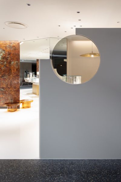
モノトーンの共用部に対し、点在する色鮮やかな緑青銅板が独特の表情を生み出す。ミラーにより空間を切り取りながら、広がりも感じられる空間を目指した。
Principle use: SHOP
Production: D.BRAIN
Credit: Lighting design: BRANCH LIGHTING DESIGN / Shop VMD design: PALMETTO INOUE Maki Izutsu
Building site: Kyoto Takashimaya
Total floor area: 50.7m2
Design period: 2021.11-2023.4
Construction period: 2023.4-2023.5
Photo: Takumi Ota
Website:https://hiro-taka.com/
The interior design for Kyoto Takashimaya store of the jewelry brand, Hirotaka. The site is a long and narrow 14m x 3.5m island-shaped plot adjacent to the escalator in the common area.
At the rear of the store, we installed a bright and dynamic wall made of a 3m-wide copper plate with a green rust finish. The corner facing the aisle and the side of the POS counter are also covered with the same copper plate. Instead of adopting standard green oxide processing, we designed the plate through trial and error by making samples and balancing the brown and green areas of the copper plate base.
Using a white epoxy resin-based floor coating, we created a glossiness reminiscent of a gallery while brightening the inside of the shop. The central fixtures, which vary in height, are painted with glossy white to make them appear to rise from the floor, giving rhythm to the display. The legs, two pillars supporting on the left and right sides, give a floating effect. The ceiling above the back wall of the store is folded up, and straight indirect lighting is installed at the end of the section, illuminating the copper plate and white wall. The pendant light above the POS counter matches the tone of the copper plate inside the store, adopting a design that looks like a disc-shaped copper plate that has been cut and bent. The façade is gently divided from the common area by a 4-meter-wide gray glass wall.
In contrast to the monotone common area, the scattered, vivid green copper plates create a unique expression. We aimed to create a space with a sense of spaciousness while mirrors are used to delineate the space.