主要用途: 整骨院
施工: 中島組
クレジット: ブランディング、グラフィック:サン・アド / 照明計画:BRANCH LIGHTING DESIGN
所在・会場: 大阪 西天満
延床面積: 51.8m2
設計期間: 2021.12-2022.5
施工期間: 2022.5-2022.6
写真: 上原勇(サン・アド)
ウェブサイト: https://plusseikotsuin.com/
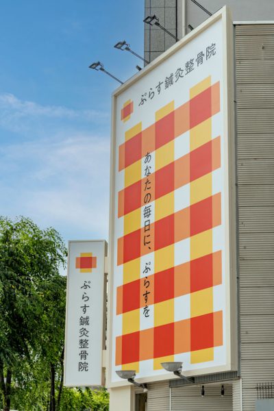
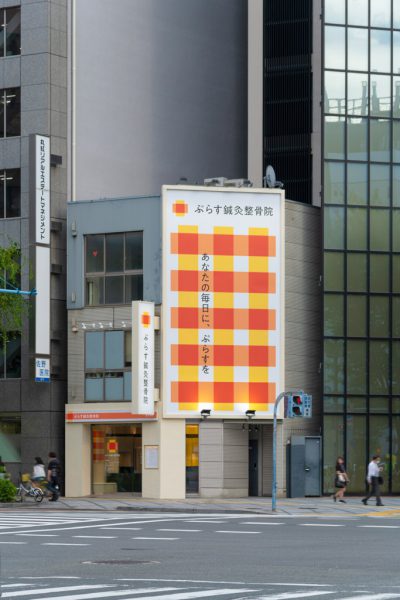
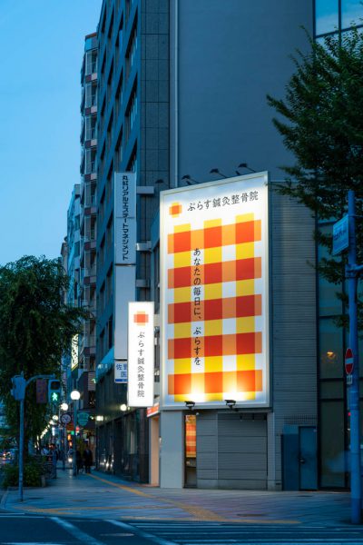
東京、大阪を中心に展開する整骨院、ぷらす鍼灸整骨院がCIの刷新、リブランディングを行う中、大阪 西天満の新店の内外装計画を手掛けた。新しいロゴマークのオレンジ色は、健康を願うぷらす鍼灸整骨院のシンボルカラーであり、シンプルで力強い「ぷらす」マークは、「あなたの毎日に、ぷらすを」というメッセージを表現している。ぷらすマークを発展させて生み出したチェック柄は、患者ひとりひとりに「ぷらす」が広がっていく様子をイメージしている。
幹線道路の交差点という立地から、ファサードにはグラフィックを施した既存建築二層分の大看板を掲げ、通りを行き来する人々の目を引く。
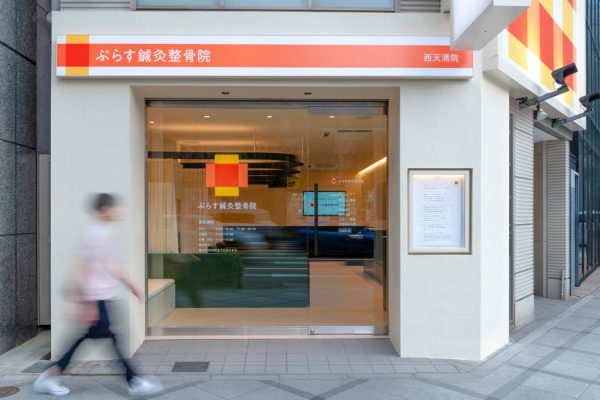
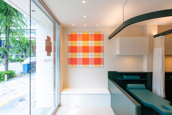
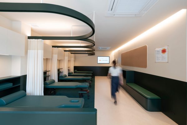
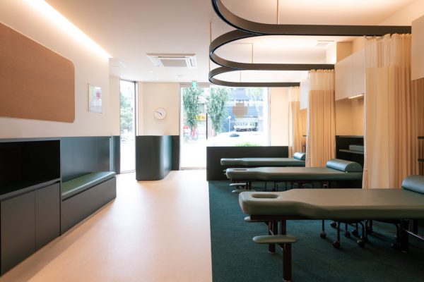
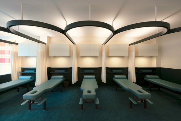
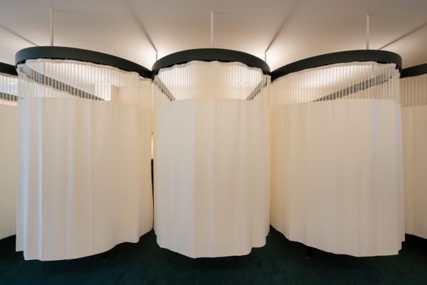
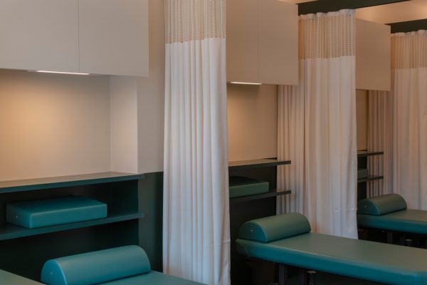
外装のあらゆる面に情報が掲示されていた既存店舗の外装イメージを一新し、シンプルな発光看板とファサードのグラフィック、壁面に埋め込まれた内照式の看板にのみ情報を集約した。間仕切り壁の無い空間に、上下の色分けと目線の違いによるゾーニングを施し、施術エリアと待合のエリアにおいても色による切り分けを行っている。立っている人と待合椅子に座っている人の目線はベージュに注がれ、施術を受けている人の目線は深緑色に落ちる。ベンチ、カウンター、ベッドなどの家具も深緑にすることで、ノイズを減らし空間に統一性をもたらす。ファサードにも使われている新しいロゴマークを、木のあたたかみを感じる程度に木板に出力し壁面に貼ることで内外の空間を繋ぐ。半円状にひかれたカーテンが空間を柔らかく仕切り、仕込まれた間接照明が暖かい表情を見せる落ち着いた照明計画とした。
ロゴマークにとどまらないグラフィックが空間に調和し、地域の人たちがより親しみやすく、身近に感じられるような内外装の設計を試みた。
Principle use: OSTEOPATHIC CLINIC
Production: Nakajima Group
Credit: Branding,Graphics: SUN-AD / Lighting design: BRANCH LIGHTING DESIGN Building site: Nishitenma, Osaka
Total floor area: 51.8m2
Design period: 2021.12-2022.5
Construction period: 2022.5-2022.6
Photo: Isamu Uehara (SUN-AD)
Website:https://plusseikotsuin.com/
While Plus Acupuncture and Chiropractor Clinic, the chiropractor clinic which operates mainly in Tokyo and Osaka, was undergoing renovation and re-branding of its CI, we worked on the interior and exterior decor of the new practice in Nishitenma, Osaka. The orange color of the new logo mark is the corporate color of Plus Acupuncture and Osteopathic Clinic, and is auspicious for good health. The simple but impressive clinic “Plus” mark expresses the clinic message “add a Plus to your everyday life.” The plaid pattern, which was developed from the Plus mark, is an image of how "Plus" spreads to respective patients.
Due to its location at the intersection of two major roads, its facade has a large signboard spanning two stories of the existing building, and features graphics to catch the eye of people on the street.
Renewing the exterior image of the existing premises, where information graphics were posted on all sides, we decided to concentrate information graphics only on simple luminous signboards, facade graphics, and internally illuminated signboards embedded in the walls. In a space with no partition wall, there are color-coded upper and lower areas and zoning according to the difference in line of sight, and color coding also contributes to differentiating the treatment area and waiting area. The sight lines of those standing and those sitting in the waiting chairs go to the beige-colored area, while the sight lines of those undergoing treatment fall to the dark green area. Furniture such as benches, counters, and beds are also consistently dark green to reduce noise and bring unity to the space.
The new logo, which is also used on the facade, is printed on a wooden board affixed to the wall to give a warm feeling of wood, to thereby connecting the interior and exterior spaces. The curtains drawn on semicircular lines softly delineate space, and the indirect lighting enables a calming atmosphere that provides a warm look.
We tried to design the interior and exterior so that the graphics, which go beyond the logo mark, harmonize with the space and make it more familiar and accessible to local residents.